Target Audience research.
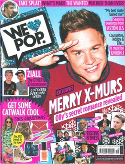
This magazine cover is suitable for my target audience because it aims at teenagers which is who I have aimed my magazine at. The front cover of this magazine is very intriguing to the target audience, because it has a large image of a famous figure, and therefore many young teenagers will be familiar with this person. Also, there is a lot of information on the front cover and therefore this will also attract the young audience because the stories relate to what teenagers like to read and enjoy. The fact that there is a lot of bright colours on the page will attract the young teenager because it isn't boring and it is intriguing. Also the fonts that are used will also appeal to a teenage audience because they are all varied and this makes the cover much more attractive. The text is also spread out all over the page and therefore this makes the information stand out more to the audience rather than let it go unnoticed and unattractive. 'We Love Pop' magazine is aimed at teenage audience which is why it is perfect for my target audience research as it appeals to that age bracket. For my design of my magazine, I have taken some inspiration from these pop magazines, because they are targeted at a young audience, which is what I have decided to base my magazine on, so therefore the language that has been used on this magazine could help me when I am deciding how to do certain things within my magazine, and how to lay different things out on the pages.
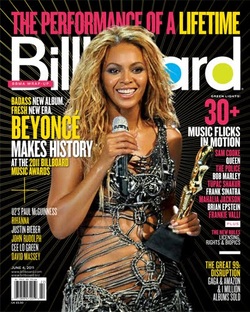
'Billboard' magazine has a target audience of teenagers so therefore I have decided to use this as my target audience research. The front cover shows an image of a famous figure which will automatically attract the young female audience, because they will look up to this person as a role model. The colours that have been used on this front cover make the overall magazine look very attractive because they stand out a lot, and this will catch the eye of the reader almost instantly. The text fonts that have been used are also very well collaborated with each other. The bright yellow makes the dark background stand out a lot and therefore this is good because it means that they audience will be much more attracted to the magazine and they will want to purchase it. The bold headings on the cover also set a scene for the entirety of the magazine as the audience will be enticed into reading what is inside and therefore this is again a big part in making the magazine attractive for the target audience.
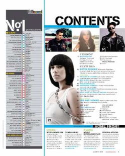
This contents page is a good template for me to take ideas from when creating my magazine, as it has a lot of the features that I am looking for. I like the way in which the page has been layed out, and I think that it is very informative. However, the page does look slightly over crowded, and this is not an attractive quality, because it means that the audience will be put off by the amount of text that there is on the page and they won't want to buy the magazine, or they might like the fact that there is a lot of text as it means that the magazine will include more things such as stories that they are interested in, so in theory it could work both ways in terms of pleasing the audience. This contents page links to my target audience, which is young teenagers that enjoy pop music, and it has a lot of well known singers on it, so therefore this is going to be an instant hit with the customers because if they know of a famous person, that is included in this particular magazine then they are more inclined to buy the magazine.
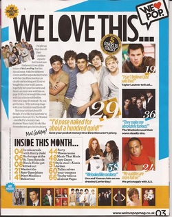
This magazine is quite a good link to what I am planning to make my magazine look like, it is a pop magazine so it is ideal for my target audience, and there isn't too much text so it would work well with the younger audience as they wouldn't get bored easily. The heading on the contents page is very bold so it stands out well, and will immediately attract the audience, and the image below is of a popular boy band, which many teenage girls will like, so therefore this will be an instant hit with them and will definitely make them want to buy the magazine, so therefore I have taken some inspiration from this, so that my magazine will also be successful. The colours on this contents page work well together, and they aren't overly bright, which means that they don't overpower the rest of the page, such as the images and fonts. There are a lot of images on this page, so therefore this means that it will catch the eye of the audience, so that they will be enticed to buy the magazine. Also, there isn't too much text, so therefore it should attract more people,

This double page spread comes from a pop magazine and is very bright and informative. In the centre of the page there is an image of Nicki Minaj, who is a very well known pop artist, and she is especially known by younger audiences, which is why I have decided to use this double page spread as an inspiration for my music magazine, and in particular my own double page spread which I will design. There are a range of different fonts used on this double page spread, which really make the pages stand out and look a lot more professional. The text above Nicki Minaj' name, is particularly unique, and the black font blends very well with the pink fonts which are used for the other heading, and the pink background.

This double page spread is again very suitable and it links well with my target audience. There are two images on the pages and the main image is of the artist looking directly at the camera, which makes the page more enticing and attractive. There is a lot of text on this double page, and it isn't spread out, whereas the above double page spread the text is more spread out so it makes the pages look less crowded. Because the text is all on one page it automatically makes it look as though there is more text, which will make the double page spread as a whole slightly less appealing, and this could be a problem in terms of selling because it might not attract the audience. The colours on this page could be slightly brighter to make it more appealing to the audience because there aren't that many outstanding colours used, so therefore the pages aren't very attractive.
