This is one of the original images that I used for the front cover of my magazine, I edited the image using Photoshop, so that it didn't have the whole image in it. The only part of the image that I wanted was the part with the person actually in it. I used this image, along with another image for my front cover, which I thought were quite good. This image was located on the bottom right hand side of my front cover and there was some text over it. As previously stated, I used a photo manipulation programme to edit the image so that it looked like how I wanted it to look this include; light, cropping, and the overall image as a whole. In terms of colour the image collaborated well with the colour of my fonts and background, however the colour of my background is far too dark, and therefore I will need to change it. The shot that I have taken is a medium close up. which allows you to see the upper half of the persons body. This image shows quite a good amount of light I it, which is important, as it makes the person in the image easier to see. If the image is not clear then it will make the cover of the magazine look less attractive and unappealing. Also, because I have a photo of a young person in the image, it will hopefully encourage people of that age to buy the magazine, and this is important to me, because the target audience that I have decided upon for my magazine is an young teenage audience.
This is the original image that i have used on my front cover. There is no editing that has been done to this image yet, and it is still of a good quality. The medium close up shows the top half of the persons body, and he isn't looking directly at the camera. When I edit this image I will probably change the lighting of the photograph, in order to make it blend better with the background of my page. This is a medium close up shot which is what was required for the magazine cover, however the fact that the audience can't see the face of the person in the image, it might mean that they don't automatically become attracted to the magazine, so therefore in order to improve this, either the photograph could be edited so that it becomes more appealing, or the positioning of the image could be altered to make it stand out more. However, because the image is not dominant on the front cover, it doesn't matter as much that you can't see the persons face, because it wouldn't necessarily need to be noticed as much as the main image on the cover.

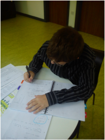
This image that I have taken shows two people standing against a wall. This photograph hasn't been edited, so therefore, in order for the image to become more attractive on the magazine, it will need to be edited and this includes the positioning of the models, and the lighting of the photo. I have used this image on my contents page. The image isn't that sufficient because it doesn't have a proper layout to it, so therefore when I take my photographs for my real product, I will need to take into consideration the positioning of the models and how good the image will actually look blended with my other images and fonts on the page. In order to edit my photograph I will use Photoshop, which will enhance the quality of the image to make it look more sufficient on my magazine. Editing the images is important because it allows me to remove ay parts of the image that I don't want, and also to change certain parts of the image, and add things that I want it to have.

This image was also included in my preliminary, and it featured on my contents page. It was edited so that the parts of the photograph that I didn't want to appear on my page were removed. For example, on the left hand side on the image you can see that there is someone's hand in the shot, so in order to make the photo look more effective and sufficient I edited it, so that you could no longer see the hand in the image. Furthermore, from this image, you can see that there are other people in the background, however I was unable to edit them out of the image, because of the fact that it would have altered the original image too much. The photo is also very natural, meaning the models in the image don't look like they have been positioned specifically, which is, in theory what I wanted them to appear like, however this might not look professional, so therefore I will have to look into whether or not I think that kind of positioning and facial expressions is what I want.

I planned this image so that it looked as though the models in it were just having a natural conversation, and so that the setting of the photo looks natural. I have not edited this photo, so therefore this means that no changes have been made, this could be an issue because it means that the image may look less professional, therefore when I am planning my photos for my final product I have all of the right editing skills so that I have change anything in the image that I don't particularly like, for example in this particular image, I might change the lighting of the room, and I could either do this by formally changing it and then retaking the photo, or by using the image manipulation programme, which is what I would probably do. Also, I could reposition my models so that they were in different places, perhaps somewhere a bit more openly spaced rather than a small room.

The final image that I used for my preliminary, is quite similar to the above photo, and this could be an issue as they are so alike. However, again I have asked the models to pose in specific ways so that I can have the picture how I want it to look. Furthermore, I have not edited this image, so everything that is in it is natural, and this could again be a problem, as there may be certain elements in the image that I may want to change. So, therefore, when I start to plan my images for my final product I will know how I need to edit them in order to make them work with all of my other images and fonts.
