
MastHead: The Masthead on the magazine is quite bold therefore it does stand out to the buyer, however it is partially covered by the main image which makes it more difficult for the buyer to see which magazine it actually is. The mast head font is a bold white colour, therefore it blends well with the blue background of the magazine.. The masthead also has the 'A' and the 'D' filled in with a blue and green colour, which makes it more attractive.
Main Image: The main image on the magazine cover is of a well know figure, in this case Bruno Mars, and this is important to the magazine to help get people to buy it. Also the image is quite large, and fills most of the page, so therefore it stands out more to the person buying it, and if the person likes the figure on the cover they will be more likely to buy the magazine.. The figure appears to be looking directly at the camera which shows that it is quite a dominating pose, which will entice more people to buy the magazine.
Headings: The headings on the front cover are a variation of different font sizes and colours and this is important because it makes the cover stand out more to the buyer. Also, the headings are spread out well on the page rather than all being put together, which, again, makes the cover stand out more and look more attractive. There isn't too much information either which wouldn't bore the buyer and intrigue them more.
Barcode/Price: The barcode on the front cover is located at the bottom left hand corner, this is so that it is the last thing that the buyer sees when deciding whether they are going to buy the magazine or not, this is done so that the buyer won't notice the price of the magazine and put it down again, once they have had a look through the magazine they will then want to buy it more, probably without actually realising what the price of the magazine is.

Masthead: The Masthead on the magazine is very big and it is a very dominating part of the magazine which is important because it will attract the buyer to the magazine. The font colour is white which blends well with the blue background, and the other fonts on the cover to make it appropriate for the audience. Because the font is very bold it makes the magazine stand out more, and significantly, because it is the title, people will be more likely to spot it and recognise the name of the magazine and therefore they will be more likely to buy it.
Main Image: The main image on the magazine is of a well known pop star, which will attract people, and make them want to buy it. The image is very large and fills almost the entirety of the cover, this is good because instead of seeing lots of writing, which might be boring to the buyer, they see this image of Rihanna and it encourages them to buy it, especially if they are a fan of her.
Headings: The headings on the cover vary in font size, colour and style, this is important so that all of the text isn't the same and therefore the buyer will be more attracted to it, making them want to buy it. Also the headings are spread out over the page therefore it makes the cover look less 'crowded' and easier to approach.
Barcode/Price: The Price of the magazine is located at the bottom of the magazine, on the right hand side, however it is still fairly noticeable, meaning it might attract the person wanting to buy it, quicker than the other information on the cover would. This could mean that they wouldn't bother to read the other information on the page because they think that it is unreasonably priced.

Masthead: The masthead on the front cover of this magazine is quite bold and brightly coloured, however it is partially covered by the main image on the front cover, but because this magazine (Rolling Stone) is such a well known, and popular magazine, most people would still be attracted to buy it. The masthead is located at the top of the page in the centre, which makes it stand out more to the buyer.
Main Image: The main image on the cover of this Rolling Stone magazine is a photo of Whitney Houston, and because she is such a well know celebrity, and liked by a lot of people. The image has clearly been edited, this is to set an icon for an audience, who will aspire to be like her. The way in which her hair and make-up has been done will influence what people think of themselves and they will want to look up to her.
Headings: The headings on the cover are similar in terms of font size and style, and they are all placed on the left hand side of the page, which is suited to this style of magazine, because of how everything else is positioned, however it might look less crowded if the headings were more spread out on the other side as well.
Price/Barcode: This magazine doesn't have a barcode on its front cover, however the price of the magazine is located at the top in the right hand corner, which is a perfect place for it, because it is small as well therefore the buyer won't acknowledge it straight away, and will definitely be more likely to buy the magazine.
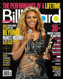
This front cover of Billboard magazine has a main image located in the centre which will immediately intrigue the audience and because it is a well know figure this will encourage people to buy it. The colours that have been used for this front cover go very well together, and they make the page stand out and look more attractive, which will encourage the audience to want to read the magazine and hopefully buy the magazine. Furthermore, there are a wide range of text fonts included on this cover, such as small and large with different styles and this makes the cover more attractive and less boring, and clearly this is important to the publisher as they want people to be attracted to the magazine so that they will want to buy it. The barcode on this magazine is located in the bottom left hand side of the page, and this is a good place to have it, because it means that it won't be the first thing that the buyer will se and therefore before they know the price of the magazine they can have a scan through it to see if it's what they are looking form, then they can check the price of it. Also, I have picked up throughout the entirety of analysing the front covers that the way in which the information is scattered around the page makes is very important. Each of the covers have a good amount of text, but not too much so that it looks overcrowded and this is good because it will keep the reader entertained without boring them with too much information.
