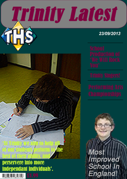
The purpose of the preliminary exercise is to work with
different programmes to design a school magazine cover. The cover should include
information about the school, and images which give out a good representation.
For my magazine design, I have made sure my text colour, font and style is
appropriate to my target audience, which is high school teenagers, maybe even
adults, who have an interest in music or enjoy listening to music. My magazine
cover (below) has a wide range of texts, so that it attracts my teenage/adult
audience, if my magazine does not appeal then it will not sell, which is
important, because I want the images that I have used to engage the target
audience. I have made sure that my barcode on my magazine is right at the
bottom, along with the price, so that it is not the immediate attraction for the
buyer. The price is the last thing that you want your audience to see, because
otherwise they will simply be unwilling to buy the magazine if they feel the
price is too much for what the actual product is. The buyer should scan through
the magazine before they notice the price of the item, and then, once they are
attracted to the content of the magazine, they will feel more intrigued and
likely to buy the magazine. I have been sure to think through carefully each
step in creating my cover, as I had to make sure that there was no overlapping
of text/images and that everything fitted in its allocated position. I have used
a bold font for my masthead so that it makes the magazine stand out to the
buyer.
Feedback: For my feedback I was told that my overall cover was quite good, however the font colours were not that well collaborated together and the background font didn't really blend well together with the text colour. I was told that my front cover was well structured and that my text was layed out well and that there was not too much text so the page wasn't overcrowded. Also, the images on my cover were good, but the main image was quite blurred, which effects the overall quality of the whole cover. The font used for the headings were the same, therefore it makes the cover less attractive and in order to improve, i would need to change the fonts, so that they are all different and it will make the overall cover more attractive to the audience.
