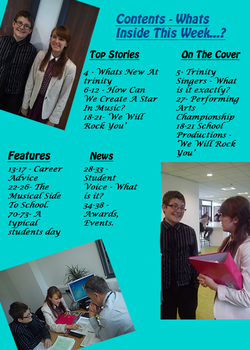
For the second part of preliminary exercise, I have
created my contents page which includes the page numbers of the information
within the actual magazine. The font size and colours that I have used, I have
tried to make them blend well with the other colours that I have used within
this page. If the colours clash then the magazine overall will be unappealing
to my audience, and as this is a magazine that I
would want people to purchase, it has to fit the criteria of
my target audience - teenagers/adults that are interested in the music side of
school, and people that generally enjoy listening to music. As you can see
below, I have layed out my contents page by separating the titles up into 4
different sections - Top Stories, On The Cover, Features and News. Having these
different titles allows me, as well as the reader, to know which part of the
magazine they are reading about, and this important because it makes the reading
of the content easier. The font that I have chosen for my contents page is a
light blue, as I think that it blends well with the images that I have used and
also the font that I have used. The fonts that I have used are Hobo Std and
Lucida Calligraphy, I planned the font before hand so that I knew what it would
roughly look like when it was completed. As for the font size, I had to be
careful, because of the images that I used, and the size of the images.
Positioning the text and the images was slightly difficult, because of the fact
that I had to fit all three images onto the page, without overlapping the text
and vice versa. Therefore, I decided to use a text font of 15, so that it was
readable to the audience and so that it didn't interfere with the layout of the
images on the page.
