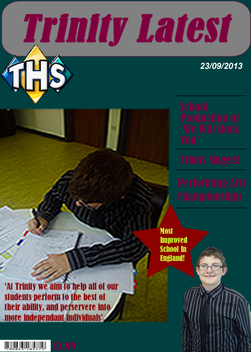
The purpose of the preliminary exercise is to work with different programmes to design a school magazine cover. The cover should include information about the school, and images which give out a good representation. For my magazine design, I have made sure my text colour, font and style is appropriate to my target audience, which is high school teenagers, maybe even adults, who have an interest in music or enjoy listening to music. My magazine cover (below) has a wide range of texts, so that it attracts my teenage/adult audience, if my magazine does not appeal then it will not sell, which is important, because I want the images that I have used to engage the target audience. I have made sure that my barcode on my magazine is right at the bottom, along with the price, so that it is not the immediate attraction for the buyer. The price is the last thing that you want your audience to see, because otherwise they will simply be unwilling to buy the magazine if they feel the price is too much for what the actual product is. The buyer should scan through the magazine before they notice the price of the item, and then, once they are attracted to the content of the magazine, they will feel more intrigued and likely to buy the magazine. I have been sure to think through carefully each step in creating my cover, as I had to make sure that there was no overlapping of text/images and that everything fitted in its allocated position. I have used a bold font for my masthead so that it makes the magazine stand out to the buyer.
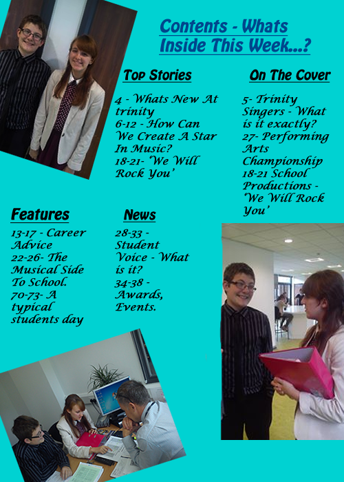
For the second part of preliminary exercise, I have created my contents page which includes the page numbers of the information within the actual magazine. The font size and colours that I have used, I have tried to make them blend well with the other colours that I have used within this page. If the colours clash then the magazine overall will be unappealing to my audience, and as this is a magazine that I would want people to purchase, it has to fit the criteria of my target audience - teenagers/adults that are interested in the music side of school, and people that generally enjoy listening to music. As you can see below, I have layed out my contents page by separating the titles up into 4 different sections - Top Stories, On The Cover, Features and News. Having these different titles allows me, as well as the reader, to know which part of the magazine they are reading about, and this important because it makes the reading of the content easier. The font that I have chosen for my contents page is a light blue, as I think that it blends well with the images that I have used and also the font that I have used. The fonts that I have used are Hobo Std and Lucida Calligraphy, I planned the font before hand so that I knew what it would roughly look like when it was completed. As for the font size, I had to be careful, because of the images that I used, and the size of the images. Positioning the text and the images was slightly difficult, because of the fact that I had to fit all three images onto the page, without overlapping the text and vice versa. Therefore, I decided to use a text font of 15, so that it was readable to the audience and so that it didn't interfere with the layout of the images on the page.