
The moodboard which I have created symbolises the different types of music genres and artists that I want to focus on for my magazine audience which is young teenagers who like pop music.. The scattered images that are on my moodboard each show different artist and magazine covers which relate to the pop audience and style. When I design my magazine, the moodboard will help me get some ideas about what a successful pop magazine should include in it and how to please the audience. The main magazine that is featured on my moodboard is 'Billboard'. I chose this magazine a lot because it stands out to me, the images, fonts and styles of the covers immediately intrigue me, and therefore, this is why I have included them on my moodboard, because it will give me more ideas on what I should include in my magazine to make it appealing for the audience. The colours that are used in the different covers and images will influence the styles that I use for my magazine, and this is helpful because it means that I can identify what I want to use, and what I think will make my magazine more attractive to my audience. The artists that are featured on the covers of these magazines will appeal to the young audience and because they are all quite well known, this will encourage more people to buy the magazines, so from this I have tried to get inspiration by looking at how I should position my images on my magazine, and hopefully this will make my magazine look more attractive and intriguing. The moodboard shows different fonts and colours that are used, and this will help me to decide what I want to use in my magazine, and as you can see from the moodboard, most of the fonts vary, and this shows a good amount of versatility within what a magazine can have in it, which will give me ideas about what I am going to put into my magazine. Finally, the styling of my magazine will hopefully be based on what I have researched in these different magazines, and I will base the images and layout of the headings and text on the magazines, not completely exact, but similar so that I know that it will be what the audience will enjoy and want. This will then help to construct the entirety of the magazine, keeping it to the target audience that I have decided upon, which is a young audience that are interested in pop music.
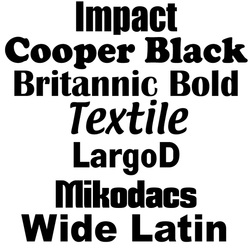
Here are some fonts that I have taken some inspiration from which I might use for my magazine cover, they each are very bold and clearer, so they will work well with an audience, because they are easy to read, and will stand out on the front of a magazine. I particularly like the Britannic Bold font, however I am not completely sure if it would work well with my magazine, because of the genre of music I have decided upon for my magazine, which is pop, it could work but it might not go with the rest of the fonts that I decide to use and the images that I put on my front cover. Some of the other fonts there could also work with my magazine as they might fit into the target audience, as it could be more what they want as a teenage audience, for example the 'Impact' and 'Mikodacs' fonts are perhaps more likely to appeal to a young audience and blend well with the images and other textual fonts that I have decided to include on my front cover of my magazine.
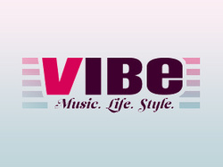
I really like this font because I feel as though it stands out a lot, and will appeal to pretty much any audience. The 'VIBE' magazine, has quite a big following and a lot of people buy it, so therefore this means that it is very popular and this could potentially have something to do with the fonts that are used on the front cover of the magazine. In each issue of the magazine, 'VIBE' changes its font colour and size, which will prove and show to the audience that it has versatility in it, so that it will try out new things to see if the target audience will still buy the magazine if things change within the creation of it, and it people do still buy it then the creators of the magazine will know that this has been a successful idea and can continue to use it in the future. So, therefore this could be a good planning idea to use for my magazine , and maybe a potential question to ask in my questionnaire.
