
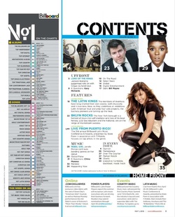
This contents page has an interesting layout, the text is spread out well, so that it doesn't look crowded on the page and makes it look more attractive. Also, it has a range of images on it which will attract the audience to it, especially if they know the figure that is in the image. The font sizes and styles are quite varied which will make the contents page more interesting, as oppose to if the font was all the same, and it would be boring. Having a good sized font is important because it means that the audience will be much more enticed to buy the magazine. Also this contents page has a lot of bright colours on it, which automatically makes it stand out more to the audience. The fact that there isn't too much information on the page is also good because it will keep the audience intrigued, rather than make them feel as though there is too much, and bore them. The page numbers on the contents page are well spread out rather than all numbers being consecutive, there is a jump in between each of the numbers, which also shows that there are more pages in the magazine, and therefore the audience will be more intrigued. There are other images on the page that some people may recognise and therefore this will encourage them to want to buy the magazine, especially if there is a story or exclusive interview of that person inside the content of the magazine.
This contents page shows the audience what exactly is inside the magazine itself. The heading is bold and clear so therefore it stands out to the audience, and also tells them what the page includes and most importantly what the page is about. On this contents page there are a number of images, but the one main image stands out to the audience as being the prominent image on this page. The image is of a well known singer and therefore people will recognise her and be attracted to buy the magazine. The singer appears to be looking down at the text that is written down indicating us to look there and read the text. The other images on the page are also of artists, so therefore this tells us that there will be something about them inside the magazine. The layout of the page is slightly overcrowded, however it does give out the information to the audience, but I would suggest making the page less crowded but still as informative. The colours used on this page are quite boring, however they do blend well with the scheme of the page, and the rest of the images on it so therefore this works quite well.
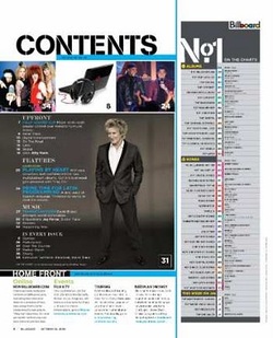
This contents page shows the audience what the page includes and what will be in the actual magazine. The fonts on the page are quite clear, and the main heading is very bold so therefore the audience will be attracted to it quite quickly. However, the other font colours that are on this page are less acknowledgeable, because they do not blend as well with the colour of the background on the page. The images on the page are very appealing because there is a well known figure in the front cover, so therefore people will be attracted to the fact that they know who it is, and will be intrigued to see what stories and exclusives there are about this famous person. There is quite a lot of information on this page which could put the audience off as they won't want to look at the page and see lots of writing, however the text that is on this page is very informative and the audience will hopefully be intrigued by it, and won't get bored by how much there is on the page.
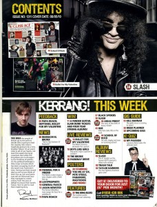
This contents page contains a lot of information, perhaps too much, but it will keep the audience intrigued. There are multiple images on this content page and therefore they will make the page more attractive and accompany the text. The colours that are on this contents page are well structured so that it makes the page look appealing, and colour is very important, as it keeps the audience enticed. The colours blend quite well together, and there is a variation in font size and style, which is important because it makes the page look more appealing to the audience and it won't bore them. There are multiple images on the contents page, however not many well know figures, so this might out the audience off, however because this is a rock magazine, this means that the audience that are meant for this magazine will be more likely to be familiar with the figure(s) that are on the page and therefore they will be more intrigued and encouraged to buy the magazine.
